Journeys Analytics
The Reporting feature is available on the Portal on the Site level in the Analytics section, where you can find more tabs for the reporting of different features - Journeys, Playbooks, Feedbacks, Activity Feed and Page Views.In this article, you will find the explanation of all the sections under Journeys Analytics, which can be seen by clicking on the Journeys tab:

Top bar filtering
For all Analytics sections you can apply Segments and Time period filtering.
Summary

- User Engagement: shows how many Journeys were launched yesterday in comparison with the average of the previous 7 days.
- Engaged Users shows each unique user who has interacted with a Journey.
- Journeys Launched shows every Journey which has been launched.
- Journeys Completed is a count of all Journeys which have been completed.
All numbers are totals for entire Sites without any date filtering.
User Engagement
An elevated number of Engaged users means that the Journeys are being used, therefore they are helping with the process they were made for. By looking at the number of Journey issues you can see that there might be problems with some of your Journeys, which you can investigate further by scrolling down the page, in lower graphs and tables.

General Overview
Journey Usage Overview
This simple table provides you with information about user success from a general perspective. It displays the following metrics for each listed Journey:
- Engaged Users: how many unique users have launched the Journey
- Runs: how many times this Journey has been launched. This number may be higher than the
number of visitors because some of them may launch the same Journey multiple times
- Users Completed (%): how many unique users have successfully finished the Journey at least
once
- Runs Completed (%): how many runs were successful from total number of executions
This table is sortable, and you can also click on each Journey name to open it in the Journey Detail section containing more detailed statistics about the selected Journey.
This table helps you understand how the numbers from the Journey Usage Overview table (above) were distributed across the time and displayed on a scale of months.
Here you can get an idea of when Journeys have been used, thus better understanding the user’s needs and the forgetting curve.

Journey Usage Trend

If the Chart has extensive data, you can switch pages by clicking on Next or Previous buttons just below the chart on the right. You can also type the number of the page which you want to switch to.
Keep in mind that the Percentage will be calculated based on the elements on the page.

Result Analysis
This section can help you to see if there are any problems with your Journeys.
This bar chart helps you to understand how each Journey performs from the perspective of its end result. Refer to the legend on the right-hand side of the page for the color coding of these metrics:
- No data: there are no data available (Typically, the user did not complete the Journey and has closed the browser without stopping the Journey)
- Fail: the Journey failed itself (Typically this happens when the element which the step is connected to has not been found, signaling that there is a problem with the Journey's logic)
- Drop off: The user stopped the Journey manually before the last step
- Success: The user has finished the Journey
This chart can be shown in Absolute or Percentage values (In the screenshot below, the chart is shown in percentage values). Again, it displays a maximum of 10 Journeys per graph page.

Result by Time
These two tables show numbers from the bar chart above distributed over time. This view can reveal whether the trends found are persistent or if these problems were exceptional in nature.

Time Effort on Journey
An important criterion is how time-consuming each Journey is. This information is presented in the form of a Box Plot chart.
The Box Plot chart has several types of information for each Journey. By hovering the bars for each Journey, you can see:
maximum and minimum, upper and lower quartiles, and also the median (as shown on the image below). The target is to have a small line with thin lines, because big differences usually indicate time efficiency problems.

This section is the lowest level of analysis, most useful for understanding the performance of one selected Journey. If you have clicked on a Journey name in one of the other Reports sections, you are redirected to the Journey detail view displaying data about that specific Journey for the selected time range.
At the top of the Journey detail view, there is a filtering bar as in all analytics sections:
This area chart helps you understand how a Journey performs from the perspective of its end results over time. You can visualize the date in Absolute Count or Percentage values (in the figure below, absolute count values are shown).

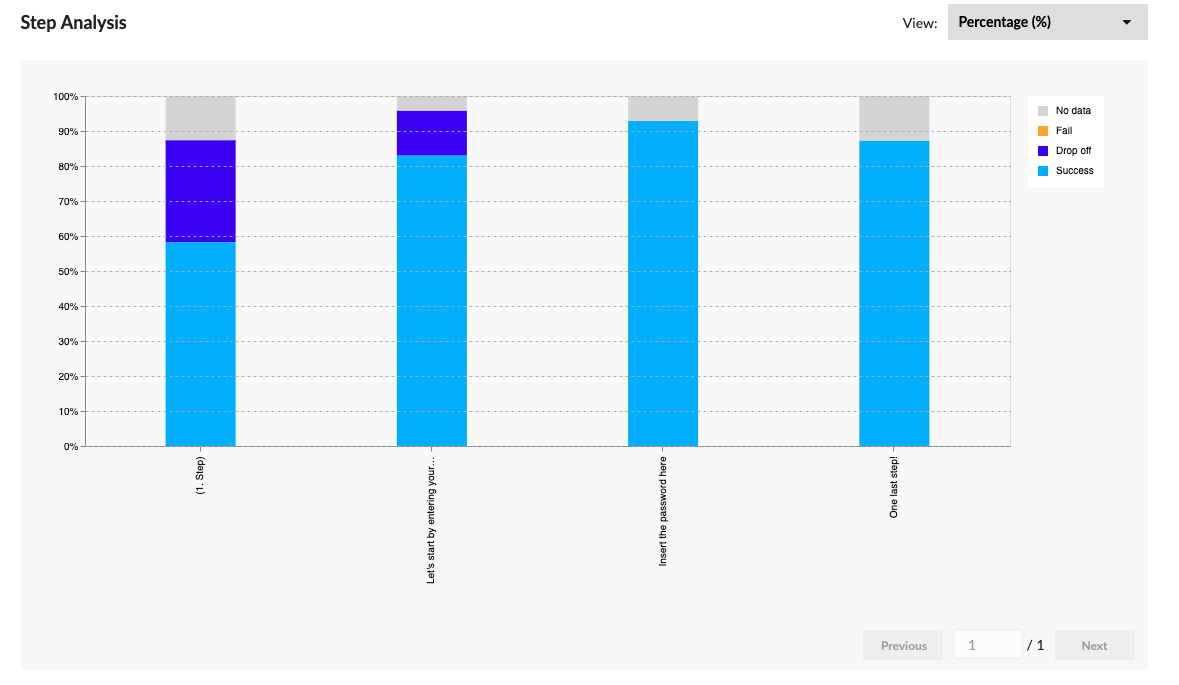
The level of details for each step provides you with information about exactly where users have had problems. Once again, the view can be configured into Absolute Count or Percentage values (In the figure below, percentage values are shown).
Another piece of information you may need is how time consuming each step is, in order to understand how much time users spend where and whether that is according to your expectations.

Was this article helpful?
That’s Great!
Thank you for your feedback
Sorry! We couldn't be helpful
Thank you for your feedback
Feedback sent
We appreciate your effort and will try to fix the article